Metaculus is an online forecasting platform. Forecasters put probabilities on questions about the future, covering subjects such as economics, politics, science, technology, climate, AI, and geopolitics. These are subjects on which opinions are abundant; Metaculus has the mildly radical idea of asking for a number.
Some questions are binary. Others ask forecasters to divide probability among several outcomes or provide a distribution for a number or date. Each question defines in advance how it will resolve, and forecasts are scored once the outcome is known. Defining “right” in advance removes one of the traditional advantages of being wrong.
That makes Metaculus different from prediction markets such as Kalshi or Polymarket. There are no contracts to buy or sell. The objective is to make accurate, well-calibrated forecasts and build a track record over time, rather than to profit from finding someone willing to take the other side.
Metaculus also combines individual forecasts into a Community Prediction, a time-weighted aggregate that is generally more accurate than most of the individual forecasts that feed into it. This is good news for aggregation and somewhat less flattering news for the rest of us. (Metaculus)
The platform has become increasingly interested in automated forecasting. Its AI Forecasting Benchmark runs bot-only competitions in which forecasts are made without a person in the loop, accompanied by an explanation, and compared with the human Community Prediction. It also runs shorter MiniBench competitions, generally lasting about two weeks, so bot developers can test an approach and learn that it was wrong on a more convenient schedule. (Metaculus)
That part deserves its own post. For now, I wanted to see what could be done through Toolforest without building a fully autonomous forecasting bot.
From question to forecast
The Toolforest Metaculus toolkit can browse questions, filter them by category, type, status, tournament, and date, and retrieve the full description, resolution criteria, fine print, units, bounds, and scaling for a particular question. In other words, it can get past the title, which is often where the trouble begins.
It can also submit and withdraw forecasts, post comments or private notes, and retrieve a user’s own predictions and comments.
Binary and multiple-choice questions are fairly straightforward. Continuous questions are less accommodating because Metaculus expects a cumulative probability distribution in its internal format, which is not how most forecasters naturally describe what they think will happen.
The Toolforest tool instead accepts ordinary percentiles in the question’s own units and converts them into the distribution the API requires.
A forecast can therefore look like this:
10th percentile: -20,000 jobs
25th percentile: 5,000 jobs
50th percentile: 50,000 jobs
75th percentile: 90,000 jobs
90th percentile: 125,000 jobs
When a continuous forecast is entered as percentiles, the toolkit converts it into the distribution Metaculus expects, taking care of the question’s scaling, interpolation, and boundary rules.
That is already useful for an individual forecaster. The more interesting question was what happens when Metaculus is combined with the other Toolforest toolkits.
The crowd is there. The API is another matter.
My Metaculus account is authenticated, but it does not yet have the expanded Bot Benchmarking data-access tier.
That tier provides programmatic access to the current Community Prediction, question text, and resolutions for a larger set of approximately 250 open questions and 250 resolved questions. The 250 is not a quota on how many forecasts a bot may submit. It describes the larger set of questions whose data the token can retrieve, which is a less exciting use of the number but an important distinction. (Metaculus API)
Before implementing the toolkit, I spent some time playing with the API to see what the current token could actually access. I sampled 40 open questions and 40 resolved questions using the default feed ordering. None of the 80 returned a Community Prediction. A probe of the bulk CSV export endpoint returned a 403.
Zero out of 80 is not a subtle result, but it is still a sample rather than a census. It does not prove that no question available to the token carries a Community Prediction. It does describe the practical experience of using it.
This is specifically an API limitation. It does not mean every Community Prediction is hidden on the Metaculus website. The same Russia-Ukraine question discussed below, for example, displays a Community Prediction in the browser even though the current token did not receive it through the API. (Metaculus question)
The website and the API, as sometimes happens, have different ideas about what I am allowed to see.
At first glance, the missing aggregate is a substantial limitation. It also changes the exercise. Instead of reading the consensus, the system has to construct a forecast.
Metaculus supplies a well-defined question, the resolution rules, and the eventual score. Other Toolforest toolkits can supply the evidence.
Turning Kalshi prices into a Metaculus forecast
I started with this prompt:
Find a Metaculus question about an upcoming US economic release. Look for related Kalshi and Polymarket markets and tell me what information they give us that could be useful in forming a Metaculus forecast.
The Metaculus toolkit found:
How many jobs will the U.S. economy add in August 2026?
This is a continuous question. It resolves from the Bureau of Labor Statistics Employment Situation release using the change in seasonally adjusted total nonfarm payroll employment between July and August. The forecast must be a distribution rather than a single number. (Metaculus)
Kalshi had a closely matching event consisting of separate threshold markets. When I ran the query, the live market probabilities included approximately:
More than 40,000 jobs: 57%
More than 50,000 jobs: 52%
More than 60,000 jobs: 44%
There were additional thresholds above and below those values. Taken together, the contracts formed a rough survival curve. Thirteen yes-or-no markets had, without quite meaning to, assembled most of a probability distribution. (Kalshi)
The useful part of the response was:
Kalshi’s separate threshold contracts accidentally draw a probability distribution. Invert the probabilities, interpolate between the thresholds, and the result can be expressed as percentiles suitable for a Metaculus forecast.
The contracts are traded separately, so they are not guaranteed to form a perfectly coherent distribution. Thin markets and wide spreads should count less than deeper markets, and the curve may need to be made monotonic before it is used.
Polymarket did not provide an exact duplicate of the payroll question in that search. It did have a distribution over the August unemployment rate, with separate outcomes for 4.0%, 4.1%, 4.2%, and other values. That is related labor-market evidence, but it is not the same variable. Unemployment and payroll growth are close enough to be introduced at the same party, not close enough to be mistaken for each other. (Polymarket)
This is a useful example of composition without much ambiguity.
Metaculus defines the quantity to forecast. Kalshi supplies a market-implied distribution over almost exactly the same quantity. Polymarket provides related context. The model can compare the sources, account for spreads and liquidity, and convert the result into the format Metaculus accepts.
The Community Prediction would be useful as another point of comparison. It is not required to begin the analysis.
The question is narrower than the war
The second test was less mechanical.
I asked:
Find an open Metaculus question about the Russia-Ukraine war and investigate it using prediction markets and X. Tell me what looks genuinely relevant to the question and what is mostly noise.
When I ran the query, the toolkit found:
What will happen in the Russia-Ukraine war between July 20 and September 1, 2026?
The four possible outcomes were:
Negotiated De-escalation
Russian Advance
Ukrainian Advance
Continued Stalemate
The title covered an entire war. The resolution criteria were considerably less ambitious.
A negotiated de-escalation required both governments to publicly acknowledge a ceasefire, armistice, pause, or preliminary peace framework that remained in effect for 14 consecutive days before September 1.
A battlefield advance counted only if one side captured or recaptured a settlement with a pre-war population of at least 30,000 and held it for seven consecutive days. If neither condition occurred, the question would resolve as Continued Stalemate. (Metaculus)
The response began:
The strongest evidence currently favors Continued Stalemate.
The ceasefire branch is almost closed by the calendar. Metaculus requires 14 consecutive days of a mutually acknowledged, theater-wide de-escalation before September 1, while the current diplomatic activity is still at the proposal stage.
The meaningful battlefield question is not whether Russia or Ukraine is advancing somewhere. It is whether either side captures a settlement with a January 2022 population above 30,000 and holds it for seven days.
Many prediction-market contracts and much of the discussion on X are therefore interesting but irrelevant to the actual resolution criteria.
Polymarket had a market on whether Russia and Ukraine would reach a ceasefire agreement by August 31. Its price was very low when the query ran. This was directionally relevant, although the Metaculus condition was stricter because an agreement also had to remain in effect for 14 days. (Polymarket)
Polymarket also had numerous location-specific markets asking whether Russia would capture or enter particular Ukrainian settlements. These looked directly relevant until the Metaculus population threshold was applied.
Many of the settlements were too small.
A market about Russia capturing a Ukrainian town is not necessarily evidence for the Russian Advance outcome. The town has to have had at least 30,000 residents before the war, and control has to be maintained for seven days. Geography alone was not enough. The town also needed the right census history.
The X search produced a different filtering problem.
It surfaced reports of proposed ceasefires, mutual troop withdrawals, buffer zones, informal diplomatic meetings, statements from Russian and Ukrainian officials, and battlefield updates from the Institute for the Study of War.
Some of that was useful. A jointly accepted ceasefire could matter. An ISW assessment of control over a qualifying city could determine the answer.
A proposal announced by only one side did not satisfy the rules. An informal meeting between former officials did not satisfy the rules. A local pause, prisoner exchange, or humanitarian corridor did not satisfy the rules. Generic claims that one side was “advancing” did not satisfy the rules.
The same search also returned ideological essays about NATO, arguments over the origins of the war, commentary about Trump, speculation about a wider conflict, and repeated versions of the same reports. Much of it was related to the war. Very little of it could change the resolution of this particular question.
That was the useful distinction.
A forecasting system does not need every fact about Russia and Ukraine, a fortunate requirement given the available supply. It needs the facts that bear on a negotiated theater-wide pause lasting 14 days or the capture of a qualifying settlement held for seven days.
Metaculus tells the system what to care about before it starts searching.
Kalshi was useful in the payroll example but did not add much here. Reddit was not necessary once Polymarket and X had supplied enough material. Tool composition does not mean calling every available toolkit. It means choosing the ones that fit the question and leaving the others alone.
Lake Mead from space
I tried a third prompt:
Find an open Metaculus question that satellite data can help answer. Use Toolforest's Earth-observation tools to investigate it, and tell me what the satellite data adds to the forecast.
Metaculus had a group of questions asking for Lake Mead’s water level at the end of July in 2027, 2028, 2029, and 2030. Each asks for a probability distribution in feet. (Metaculus)
This was convenient. Lake Mead is unusually willing to be photographed.
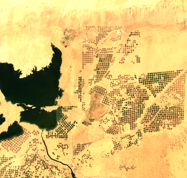
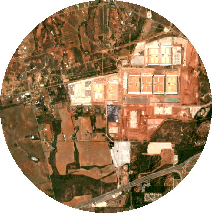
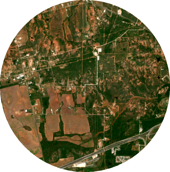
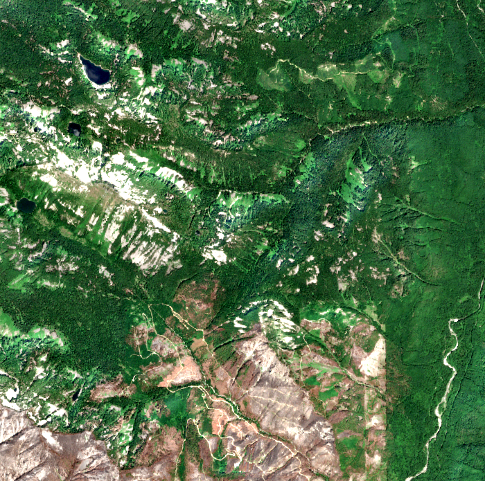
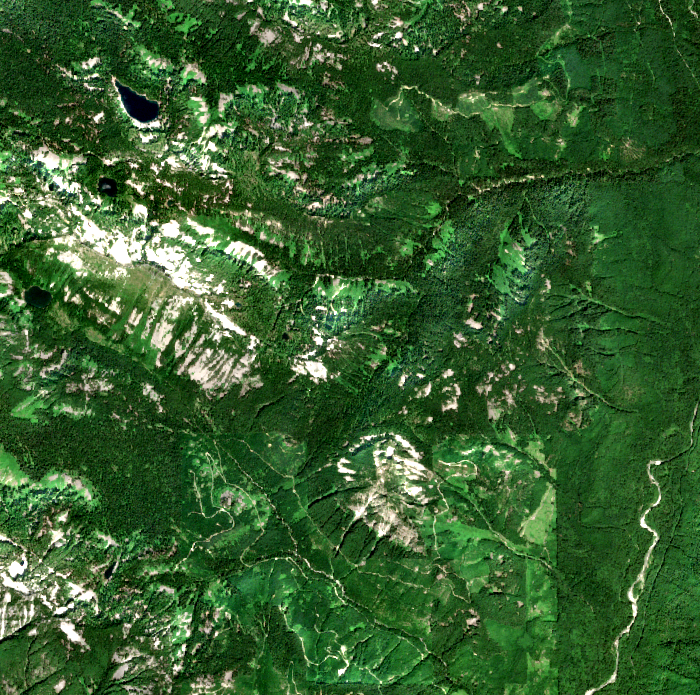
I first used Toolforest’s Geo toolkit to locate the lake, then Google Earth Engine to pull a four-panel Landsat comparison for July 1985, 2000, 2010, and 2026. I also used the EO toolkit to compare Sentinel-2 water imagery from July 2025 and July 2026.
The pictures made the changing shoreline easy to see, but I wanted something less dependent on my ability to stare intelligently at a satellite image.
So I asked Earth Engine to classify the same fixed area around Lake Mead using Dynamic World and calculate how much of it was water in several Julys:
July 2016: 10.34% water
July 2020: 10.91%
July 2022:  8.99%
July 2024:  9.86%
July 2026:  8.94%
Then I compared those numbers with the Bureau of Reclamation’s actual end-of-July Lake Mead elevations:
               Satellite water     Lake elevation
July 2016           10.34%             1,072.75 ft
July 2020           10.91%             1,084.63 ft
July 2022            8.99%             1,040.92 ft
July 2024            9.86%             1,061.49 ft
July 2026            8.94%             1,041.10 ft
The two series track each other strikingly closely. The Bureau of Reclamation records show the same rise and fall in lake elevation over those years, including the drop from 1,084.63 feet in July 2020 to 1,040.92 feet in July 2022, the partial recovery to 1,061.49 feet in 2024, and the decline to 1,041.10 feet in July 2026. (Bureau of Reclamation)
That does not mean I have discovered a satellite shortcut for forecasting Lake Mead. Surface area is not elevation, and future water levels depend on snowpack, inflows, releases, consumption, and operating rules. Satellites are observant, but they remain poorly informed about water policy.
In fact, the Bureau of Reclamation already runs a 24-Month Study that models future Lake Mead elevations under different hydrological scenarios. The useful forecasting exercise would be to combine those projections with observed conditions and independent physical measurements rather than replace them. Reclamation describes its most-probable scenario as the median hydrologic case and its minimum and maximum cases as roughly bounding an 80% range, subject to the model assumptions. (Bureau of Reclamation data catalog)
That is what the satellite toolkits add. They give the forecasting system an independent observation of something happening in the physical world, with a historical record long enough to check whether the signal means what we think it means.
For the payroll question, another market supplied useful evidence. For Lake Mead, part of the evidence came from orbit.
Before building the bot
Metaculus’s forecasting competitions make the next step fairly obvious.
A bot can retrieve a question, read the resolution criteria, gather evidence, produce a forecast, post an explanation, and eventually be scored on whether it was right. The current benchmark rules require the process to operate without a person in the loop and require a reasoning comment with every forecast. MiniBench provides a shorter cycle for trying new approaches and discovering their defects before becoming too attached to them. (Metaculus)
That is a different project from using the toolkit as an assistant.
In the examples here, the system researched the question and proposed an answer. It did not submit a forecast or post a comment. For personal forecasting, I would probably keep that last step under human control. A competition bot, by definition, gets no such supervision.
The autonomous version raises a different set of questions: how to choose which Metaculus questions are worth attempting, how much research to spend on each one, how to avoid counting the same underlying information several times, when to revise a standing forecast, and whether adding another data source actually improves forecasting performance rather than merely making the research report longer.
That deserves its own experiment, and probably its own post.
For now, the narrower result is enough. The current token cannot retrieve much Community Prediction data, but it can retrieve the questions, the resolution rules, and the machinery needed to make a forecast. Kalshi, Polymarket, X, satellite imagery, and other Toolforest toolkits can provide evidence.
The interesting part is not that all of those sources are available through one connection.
It is that Metaculus gives the system a reason to use some of them and ignore the rest.